“F” your voice over website design!
Yea, I mean it.
“F” your voice over website design!
Are you a female voice over talent?
“F” your voice over website design!
Are you a young male voice over talent like me?
“F” your (my) voice over website design, too!
But wait… I need to clarify something. This is a good thing. If you “F” your voice over website design, you’ll probably be more successful at getting more voice over clients and landing more voice over gigs. How is this possible?
I’ll tell you.

F Pattern shows heat map of where eyes travel on webpage – Nielsen (2006)
Eye-tracking researchers have found that website visitors often scan pages using an “F” pattern (Eye Tracking Update). This means that visitors focus mainly on the upper left side of the screen and then scan across the page horizontally and then down the left hand side. This can be extremely beneficial for your own voice over website. But before I tell you how you can use this to improve your voice over website, researchers have found some more cool things about where your eyes look on a website:
• Dominant headlines most often draw the eye first upon entering the page – especially when they are in the upper left, and most often (but not always) when in the upper right (Eyetrack III).
• Navigation placed at the top of a homepage performed best (Eyetrack III).
• Any content below the fold (the place where most users begin to scroll down) is rarely looked at or seen (Eye Tracking Update).
Improve your voice over website design by influencing potential voice over clients to look in the right place:
- Put your demo up near the very top of your page and make it stand out from the rest of your information. As voice over talent and coach Bill Dewees strongly believes (and I agree), your voice over demo is your number 1 marketing tool. Make it bold or “loud” when compared to the rest of your page.
- Embolden your voice descriptor words and important services. Clients are looking to find a voice over talent that has the sound and services that matches their project. Make it easy for them to know your voice’s sound and services by making those words stand out.
- Make your voice over navigation bar easy by stretching it horizontally across the top of your page.
- Test the fold on your voice over website. Visit your voice over website from many different sources (tablet, smartphone, laptop, desktop computer, etc.). If important information about your voice over services is falling below the fold, move it up!
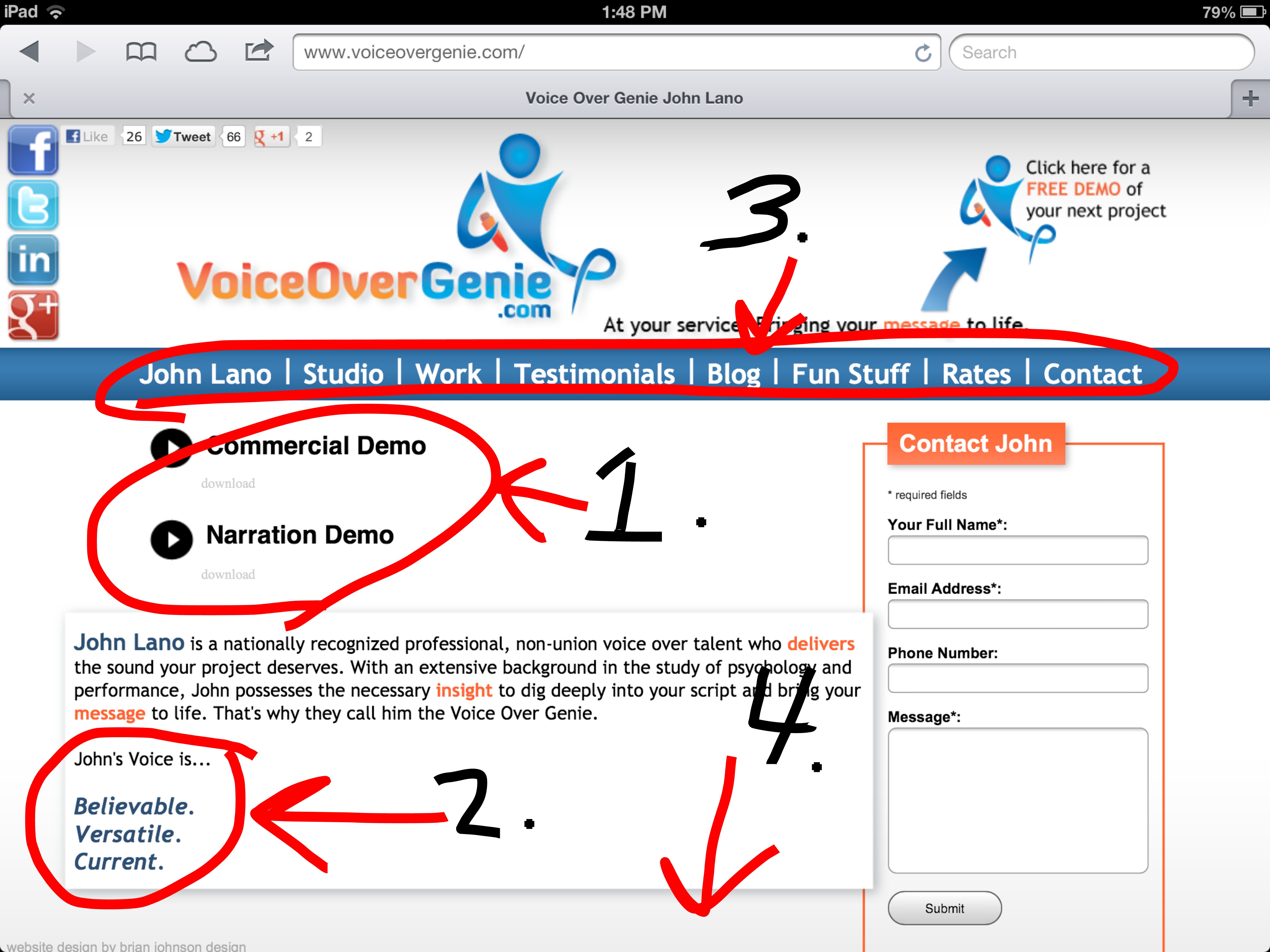
How I “F” My Voice Over Website Design (follow along in the picture below):
- My voice over demos are at the very top of my homepage and stand out from the rest of my page because of their size, color and play buttons.
- I emboldened my voice descriptors so voice over prospects and clients will easily find my young male voice over style and sound.
- My navigation bar is stretched across the top of my voice over website homepage and is easily navigated with clear and easy to read tabs.
- There is basically nothing below the fold of my voice over website. I tried my very best to keep it very top heavy so visitors would focus their attention there.
Disclaimer: There are many opinions out there about the best voice over website design. This is merely my own opinion, this time looking at it through the lens of website design eye-tracking research. Also, my voice over website design is in a constant state of upgrade and redesign. I am never satisfied and am always looking for ways to make it better. So don’t be surprised if you see a change by the time you read this. These changes were made possible thanks to the skills of my website designer and master Brian Johnson.
I hope you found this information useful. I will be writing blogs in the future about other voice over website design tips. But for now… please, go “F” your voice over website design.
**Thanks for sharing my voice over post with your friends and colleagues via Twitter, Facebook, or other social media outlets with the share buttons below.
3 Comments on ““F” Your Voice Over Website Design”
Pingback: F Your Voice Over Website Design - Male Voice O...
Wonderful post, John. I always appreciate what you have to say! 🙂
John,
I am a voice over artist who is in the process of trying to find a web designer. Based on what you outlined in this article, I was wondering if you can recommend any web designers who apply the criteria you highlight. If there is no one specific, can you recommend someone who can design a voice over website at a reasonable cost?
Thanks so much!
Ken Underhill